o v e r v i e w
Kalender / Availability:
-
ENGLISH - 3h together and 2h online shopping for you by your styling coach
DEUTSCH - 3h zusammen und 2h online Einkauf ohne Anwesenheit es Kunden
Quality before Quantity
This wonderful collaboration projects was between me and the Austrian letterpress studio in Graz, city of design 2013, named
“the IF“ which stands for Infinity factory.
Most importantly, I would like to thank Christian Ursnik for his time, patience, creative and technique support on my wonderful unique “business cards project“ and hope we will keep in touch for further collaborations!


Unique Finish
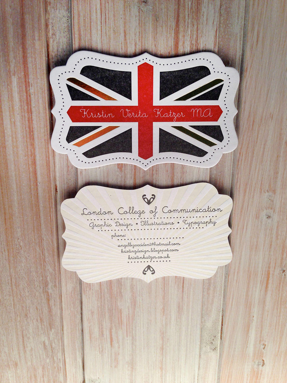
The front page of every individual business card has two different colour prints-types and a special “gold foil print“ added by hand. The individual, curvy press-cut shape gives the card its unique finish. The backside has two colours as well. However, after drawing all the shapes separately in Adobe Illustrator you have to send these digital designs to a professional company in order to produce “Klische or template-form“ for each colour in order to attach these templates later on to the Heidelberg-press for printing. The level of pressure is of great important regarding the paper-thickness and how deep the "imprint" or relief goes into the paper. If it is printed too deep with too much pressure you would see the layers from the front at the back as well! A lot of work-stages had to be passed before accomplishing the best finish.
Trust me, once you hold any type of letterpress work or business cards in your hands you will physically feel the difference compared to cheaper produced cards. Letterpress is not cheap neither is letterpress easy to handle as you need to have specific technical knowledge, a feeling for printing, paper-handling, a good eye and love to detail.
However this process and effort will be absolutely worth it! I guess the result speaks for itself >


Video:
The studio, tradition & technique
Throughout my online research about design during my travels in Australia, I was positively surprised when I found out that my hometown Graz (City of design) has its very own letterpress studio as well. In England itis a very common technique which I'm familiar with from my studies at the London College of Communication.
At the London College of Art I used letterpress as my final tool in order to finish my finial MA project. Click here to view.
The studio in Austria is named "IF factory" as in "Infinity Factory" and proudly owns three professional, original Heidelberg letterpress machines, still remaining from the 50’s until the 60’s. Sadly, the company Heidelberg, which produced these beauties, has stopped their production on some point during history. Today it is only possible to get hold on to original Heidelberg machines through the internet.
Address of the studio:
Schiffgasse 6 , A-8020 Graz/AUT
email: info@the-if.at
web: www.the-if.at
phone: +43 (0) 316 30 64 67


Making process
You have to follow various stages after ordering the different "Klisches"(german) or templates for each colour printing-process. From mixing the right pantone colour with pigments over finding the right position on the “printing-bed”, it is always about the love to detail. As the saying goes:
The devil is in the detail
you need to be sensitiv about the individual preferences. Christian, one of the designers and technician from the IF factory helped me throughout the whole developmentand also with the final stages which are for example adding the gold foil with a special pressure-machine onto my finish printed cards. The last step was about the unique shape which I achieved through press cutting with a special machine (see first larger image, right).
Especially if you print different colours you always have to make sure your printing press is super clean in order to get the best colour result at the end! Even if the machine is doing 90% of the printing process all by itself automatically, always double-check the quality of the colour, pressure and position by taking out
“test-strips” of your final work.
All colour prints and the press cut process has been done by one of the Heidelberg machines. Only the gold foil has been attach by a seperate machine.


Intention
The mass-production has flooded our market since years, in order to be different, fresh and new we should focus more on the quality of our goods and more attention to detail instead of quantity and cheap materials.
By cherishing old traditions in combination with ideas and technology of he 21st century, the IF factory is one of many ideal examples of creative which demonstrate and implement these ideas.
My main intention with this project was to visualise the beauty of letterpress, the way it is. Plus showing the audience that letterpress is still used in many studios, not only in London. History has still the power to suprise our society and achieve great results.
Info
Where does it come from? Gutenberg


Was mainly influenced by my time in London. I spent four years living and studying at the London College of Communication in the field Graphic design with main focus on experimental typography. My intention was to visualise this conection between me and the country straight away with the elegant finish of using different colours than the original union flag.
The design


“Trust in the process”
In combination with my practical achievements I decided to document my stages, mistakes and developments during the making process of my letter-pressed business cards in order to visualise the steps and stages you have to follow until you finally reach the perfection of the final product.
“When was the last time you did something for the first time?”
Personally I love to get lost in the process, as you will only find out where it takes you if you are willing to take risks.


